Set the viewport to 393x852, the layout reflows, the test passes, and you ship. Then a real user on an iPhone reports that the sticky header eats the first form field and the dropdown won't close. Emulation didn't lie exactly — it just told you about geometry and stayed quiet about everything else. This is about knowing the boundary between what a resized viewport proves and what only a real touch device can.
What emulation actually reproduces
Playwright's device emulation is more than a setViewportSize call. When you spread a device descriptor into a project, you get the viewport, the device scale factor, a mobile user-agent string, and — if the device is a phone — touch-event dispatch and the isMobile flag:
import { defineConfig, devices } from '@playwright/test';

export default defineConfig({
  projects: [
    { name: 'desktop', use: { ...devices['Desktop Chrome'] } },
    { name: 'iphone',  use: { ...devices['iPhone 13'] } },   // WebKit engine
    { name: 'pixel',   use: { ...devices['Pixel 7'] } },     // Chromium engine
  ],
});
That covers a real and useful set of failures: media-query breakpoints firing at the wrong width, images that overflow their column, a nav bar that doesn't collapse, pointer: coarse styles that never activate. If your bug is about how the page lays out at a given width and pixel density, an explicit assertion in emulation can catch it, and it does so in headless CI with no device lab.
The iPhone 13 descriptor above is worth a second look: it runs the WebKit engine, not Chromium with a costume on. That matters, when your existing CI only exercises Chromium, and WebKit is where Safari-family layout differences actually surface.
What only breaks on real touch
Emulation models the page's dimensions. It does not model a finger, an iOS Safari build, or a mid-range Android GPU. The failures that slip through cluster into a few categories:
- Touch ergonomics.
hasTouchdispatches touch events, but it can't tell you a 24px tap target is too small for a thumb, or that two controls sit close enough to mis-tap. Geometry passes; usability fails. - Hover-dependent UI. A menu that opens on
:hoverhas no equivalent gesture on a touchscreen. Emulated touch fires events, but a test that programmatically hovers still "works," hiding a control the real user can never reach. - iOS Safari quirks. The dynamic viewport that shifts as the address bar hides,
100vhovershooting the visible area, auto-zoom when a user focuses an input whose font is under 16px, momentum scrolling, and rubber-band overscroll — none of these are reproduced by resizing a headless engine. - Real device conditions. Slow CPUs, throttled networks, and constrained memory change timing and layout stability in ways a fast CI machine never will.
The honest rule: emulation is a strong proxy for layout and a weak proxy for interaction. It belongs in every pull request. It does not replace a periodic pass on a physical phone before a release that matters.
Choose breakpoints, not devices
The instinct is to build a matrix out of popular phones. That's the wrong axis. Your app doesn't respond to "iPhone 15" — it responds to CSS breakpoints. Test at those breakpoints and one width on either side, because that's where layout logic actually branches.
Find them in your own stylesheets instead of guessing:
# List the min-width breakpoints your CSS actually uses
grep -rhoE '\(min-width:[^)]*\)' src/ | sort -u
If that returns 600px, 900px, and 1200px, your meaningful test widths are roughly a narrow phone (360–390), a value just below 600, one just above, a tablet around 820, and a desktop width. Choose widths around your actual breakpoints. The example lists only min-width queries; also check max-width, container queries and other responsive logic. Identical DOM can still lay out differently at nearby widths.
Add one engine axis on top of the width axis: keep Chromium as the default and add WebKit for anything layout- or mobile-sensitive, if it is absent from your current browser matrix.
Keep the matrix affordable
A viewport matrix multiplies. Every test runs once per configuration, so the true execution count is tests × configurations, and it grows fast:
| Tests | Configurations | Executions |
|---|---|---|
| 20 | 1 (desktop) | 20 |
| 20 | 3 (desktop, mobile, WebKit) | 60 |
| 20 | 6 (full device sweep) | 120 |
Running the full sweep on every commit is how a short suite grows substantially. Tier it instead:
- On every change: one desktop configuration. Fast feedback for the selected paths.
- On merge to main / nightly: add a mobile-portrait profile and a WebKit profile. This is the responsive-and-cross-browser tier.
- Before a release: the broader sweep across the widths and engines your analytics say your users actually use.
You don't need every test at every width. Reserve the wide matrix for the flows where responsive behavior is the point — navigation, forms, checkout — and let stable, layout-agnostic tests run desktop-only.
Where TestVibe fits
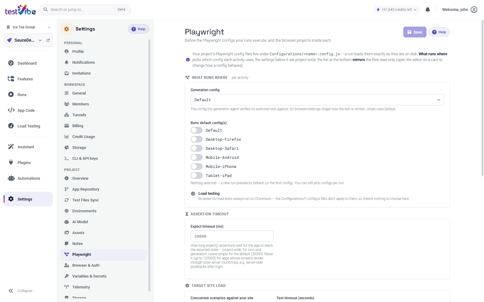
TestVibe expresses this matrix as run configurations you attach to a single run. Its presets cover the common shapes — mobile portrait at 393x852, tablet at 834x1194, desktop at 1920x1080 — across the Chromium, Firefox, and WebKit engines, and your project's Playwright config can add custom widths on top. Because a run fans out to tests × configurations, the tiering above maps directly onto which configurations you check: one for the pull-request run, three for nightly, the full set before release. Each failed row is scoped to exactly one browser and viewport, so a WebKit-only or narrow-width failure narrows the configuration to investigate; it does not establish the cause.
Emulation earns its place on every commit; a real device earns its place before every release. Get the boundary right and you catch the layout bugs early without pretending you've tested the finger. Get early access to run your suite across viewports, or read the reference on choosing browsers and viewports.